12.24.2008
Cut 'N Paste Values
Values are nearly completely roughed in. Background is currently competing too much with the focal point, Cut 'N Paste. This will be remedied by changing the material of the morgue storage lockers from a shiny metal to painted/unpolished metal, which will be lower contrast and in value, which will allow the figure to pop and read quickly.
Its coming along, but there is still a lot of work. Next I will detail the values enough that the line work will no longer be of service. Currently, I am playing with the possibility of adding color after the final values. However, the I love the emotion and tone of a black and white piece. What I am most considering is to go with a film noir/horror feel and rough up and age it as if it is an aged and damaged photograph.
12.23.2008
12.22.2008
Cut 'N Paste Line Work
This is a man who breaks into the morgue at night to cut out tattoos from old sailors and sews them onto himself. He has a tattoo around his neckline that states "Why pay if you can get it for free?" This is a little idea I've been throwing around in my head for most of this last semester, but have not had time until now to "flesh" it out if you will :)
11.20.2008
11.15.2008
10.10.2008
9.28.2008
9.08.2008
Welcome to Oceania Finished (pretty much)
It could still use a few little tweaks and finishing touches, but essentially completed.
8.27.2008
Welcome to Oceania Update
For the last three weeks this have been up to.
Here is a list of what is left to do:
-static & transmission lines to foreground telepost telescreen of Big Brother's face
-stains and maybe a couple of tears/holes to VM red banners
-glass reflections (VM windows, helicopter, & telepost)
-towering smoke clouds from bombs and fires in the distance
-utility lines (power, telephone/telescreen, etc)
-willow herb and vegetation growing over rubble to show length of war & state of disrepair
-feral creatures: birds (pigeons & crows) on powerlines, cat, dog
-little eddies of wind swirling up dust & lose trash (propaganda poster scraps/leaves/etc.)
This should be done in the next three or so days that I have to paint.
Also! evanwoolery.com is up and has been for the last two months. So check it out:
8.01.2008
4.27.2008
Color Palette Study: Welcome to Oceania
I have been giving the color test a few tries and think I finally have something roughly worth showing! I changed the color scheme a bit. It just needed to be more intense and less a serene. So I did some hunting around and thinking about a color scheme that would better convey that. Looking at Rembrandt's work I thought of how he kept so much of the under-painting in the final product and how that adds a nice sense of grit to everything. Also instead of the almost entirely analogous color scheme like I had before, the maintaining of the reddish browns and more reds makes it a complimentary color scheme, due to the green. One thing that I do second guess is if I should have a sickly yellow-green in the foreground highlights or if the more subtle palette in this piece is sufficient (it seems like it is a bad idea to get too sickly, which is why I have it this way).
I also added some clouds to spice up the sky. They seem to add a touch more emotion to everything and further drawing the eye to the focal point. The telepost/telescreen coming out of the dirty vignetted frame seems to work a lot better with the green. It seems like it is coming along and that it is honing into a more stylized and cohesive vision.
4.22.2008
Fine Tuning of Final Under-Painting
4.18.2008
Finished Under-painting!!
4.13.2008
Nearly Finished Under-painting
Almost done and here is what's left:
-propaganda posters plastered everywhere
*BB is watching you across the street on the other housefront (BB dark eyes)
-on every commanding corner (most dominant poster)
*Ingsoc @ street level with torn corner (alternately covering & uncovering it)
-helicopter (looking in windows)
*In the far distance a helicopter skimmed down between the roofs, hovered for an instant like a bluebottle, and darted away again with a curving flight.
-willow-herb straggled over heaps of rubble
-repairs
*balks of timber shoring up sides
*patched cardboard windows
*corrugated iron roof (wavy metal roof, like a shanty)
-little eddies of wind swirling dust up in bombsites& torn paper into spirals
-a few feral animals: birds mostly, rat, dog/cat
4.10.2008
Welcome to Oceania In Progress Under-painting
3.31.2008
#1 Welcome to Oceania in Progress
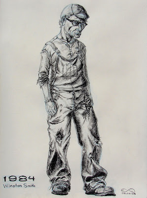
Well it has be awhile since I have posted anything, but that doesn't mean I haven't been up to anything :) I am currently in production of a painting series based on George Orwell's 1984. There will be seven large acrylic paintings and the following is some of the preliminary work for the large 6'x3' painting, "Welcome to Oceania."
Preliminary half scale line drawing (1.5'x3').
Underpainting for small color study. Half way done (10"x20").
Color study.
In progress painted line work on final 3'x6' canvas. The composition was flipped. Mainly because of the fact that the main character has the entire world in his way. The other orientation made it appear that he has already conquered everything. Hopefully this large painting will be completed by mid May.
Subscribe to:
Posts (Atom)